Leading Practices and FAQs
Want to see how to take projects from good to great? Check out our Leading Practice & FAQ Home Page!
Alchemer Community has transitioned to several helpful resources that are available within the platform. Below explores various areas where users are able to find the information they need to be successful in the application with their survey, projects, and workflows.
Alchemer Help Documentation
Search for the specific features users are looking for assistance with via the in-application search bar found when accessing Help in the top right corner of Alchemer:
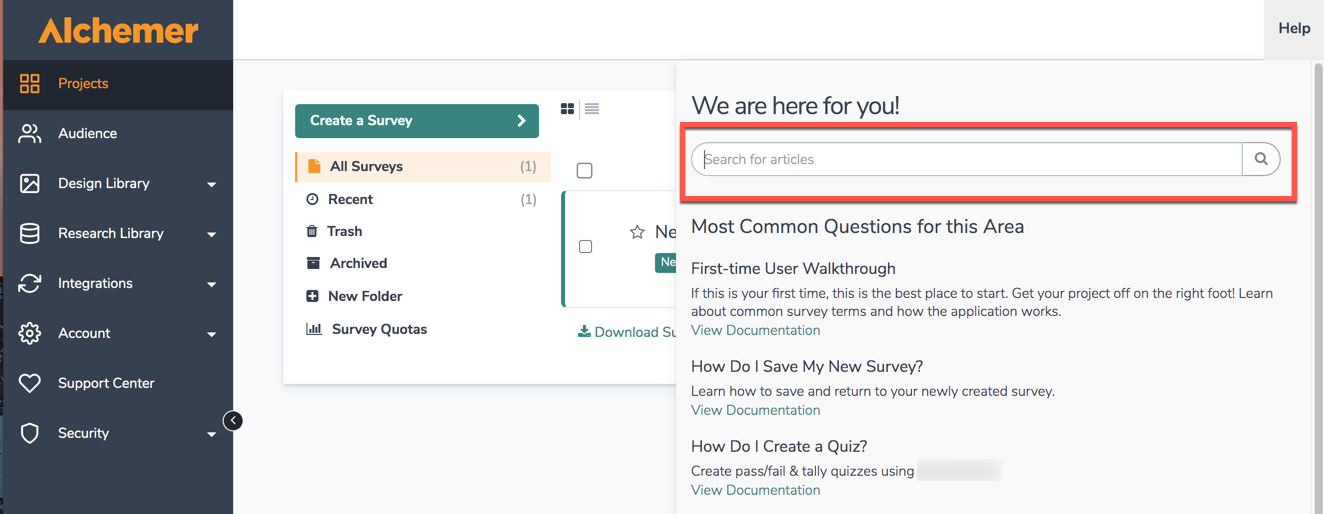
Users are able to access help.alchemer.com directly as well via the aforementioned link to search through over one thousand help articles to expedite a survey build.
Once Alchemer help is reached, users see the following screen: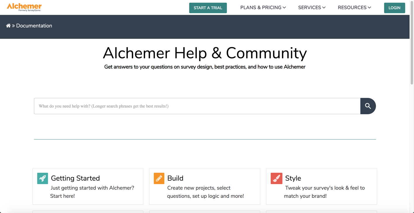
On this screen, users are able to:
- Execute searches for features via the search bar displayed.
- Select the subsections below the search bar to view a specific area of the application where help documentation is available. The subsections are as followed:
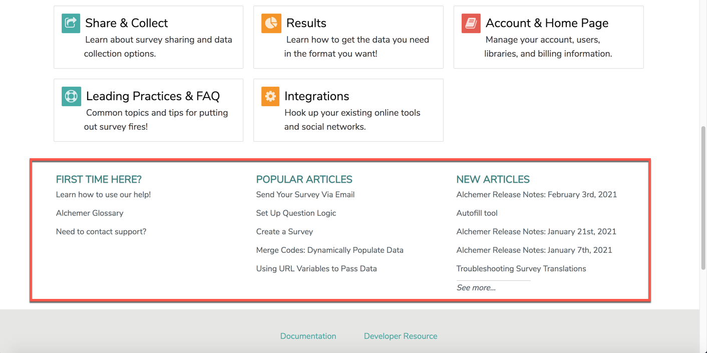
Below each subsection of Alchemer Documentation, users are able to find valuable resources in regard to their First Time using Alchemer, Popular Articles at the time, as well as New Articles that are created:
Using Articles
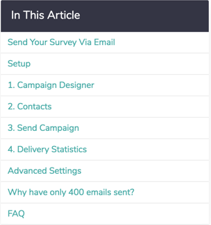
Within a help article, there are a number of different tools to help get users the answers they are looking for. The In This Article widget in the right-hand column is designed to help users orient themselves within the article. If one is looking for a quick answer, we recommend scanning the sections of the article here. Users can click these links to jump to a section within the document.
The Available on These Licenses widget lists the licenses in which the feature is available. If one accessed the help from within the application, we'll display your license for reference: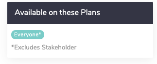
Leaving Comments
Found at the bottom of every article, users are able to leave a comment on a specific piece of documentation. If one is looking for more specific answers based on an article being read, users can comment on an article explaining what they are looking for and their question. Our documentation team will review and respond to all comments, and connect the user to the support team, Sales Teams, or Professional services depending on the nature of the comment.
Scripting and API Documentation
All users have access to our scripting and API knowledgebases. A direct link to each knowledgebase are listed below:
Alchemer Support
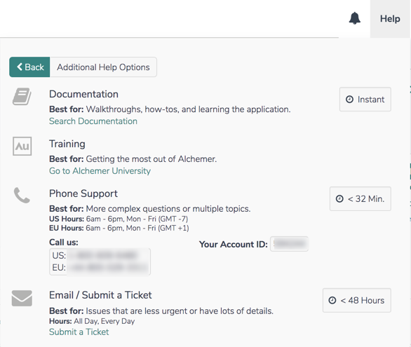
Our support team is available to assist with all aspects of building projects within the application. Create a Support ticket by selecting Help > No, show additional Support options. Select Submit a ticket and provide the necessary information. Additionally, our teams are available for phone support, and the phone number is found on this page as well:
Alchemer University
Alchemer University hosts a variety of self-paced courses, providing users with the opportunity to increase their knowledge and build out surveys, projects, and solutions swiftly. Within AU University, Alchemer users are walked through various features step-by-step, and be tested on what they learn to ensure knowledge retention.
New courses are available quarterly to assist in becoming an Alchemer power user!
Accessing Alchemer University
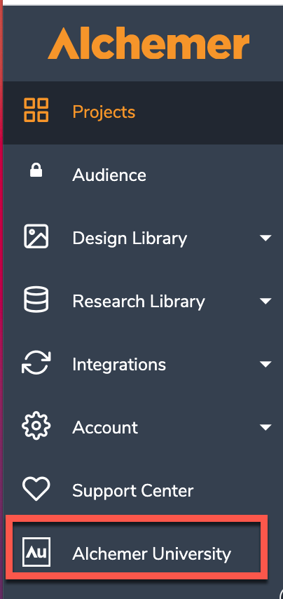
- When logged into Alchemer, via the Lefthand Navigation Menu, click Alchemer University:
- On the next screen, click Go to Alchemer University. Users see a list of self-paced programs to assist in becoming a power user!

For more information on Alchemer University, follow the link here.
